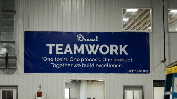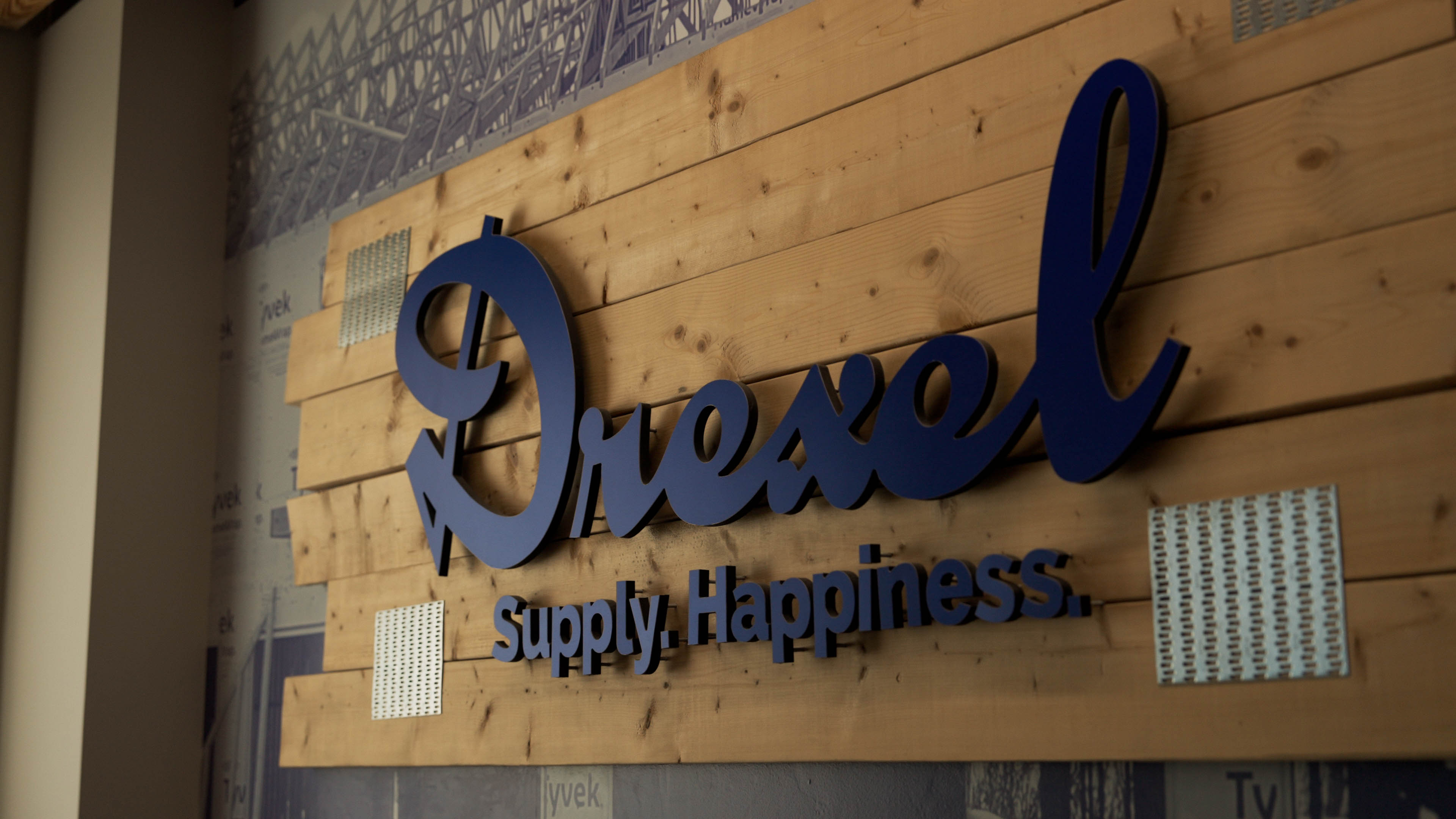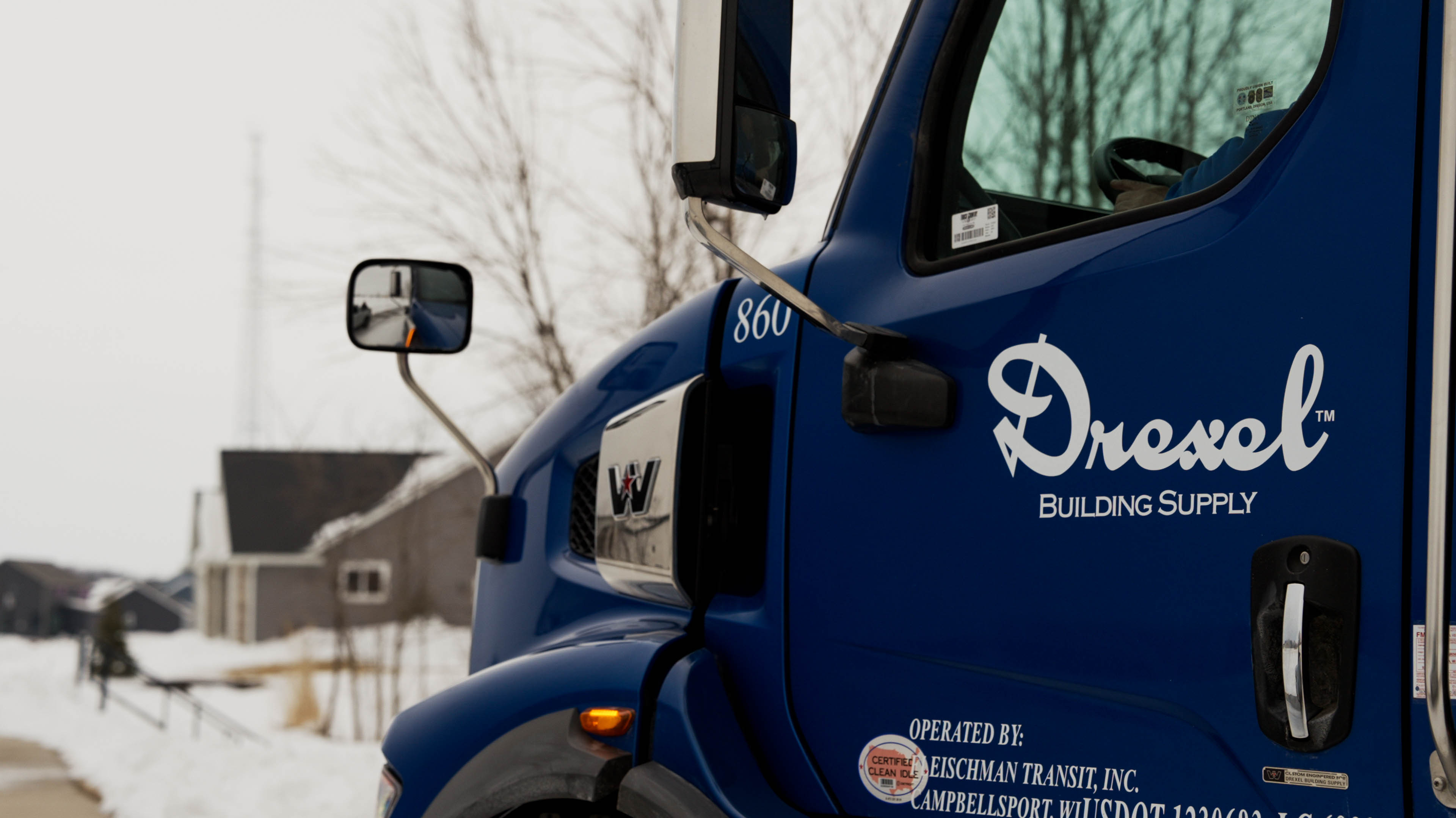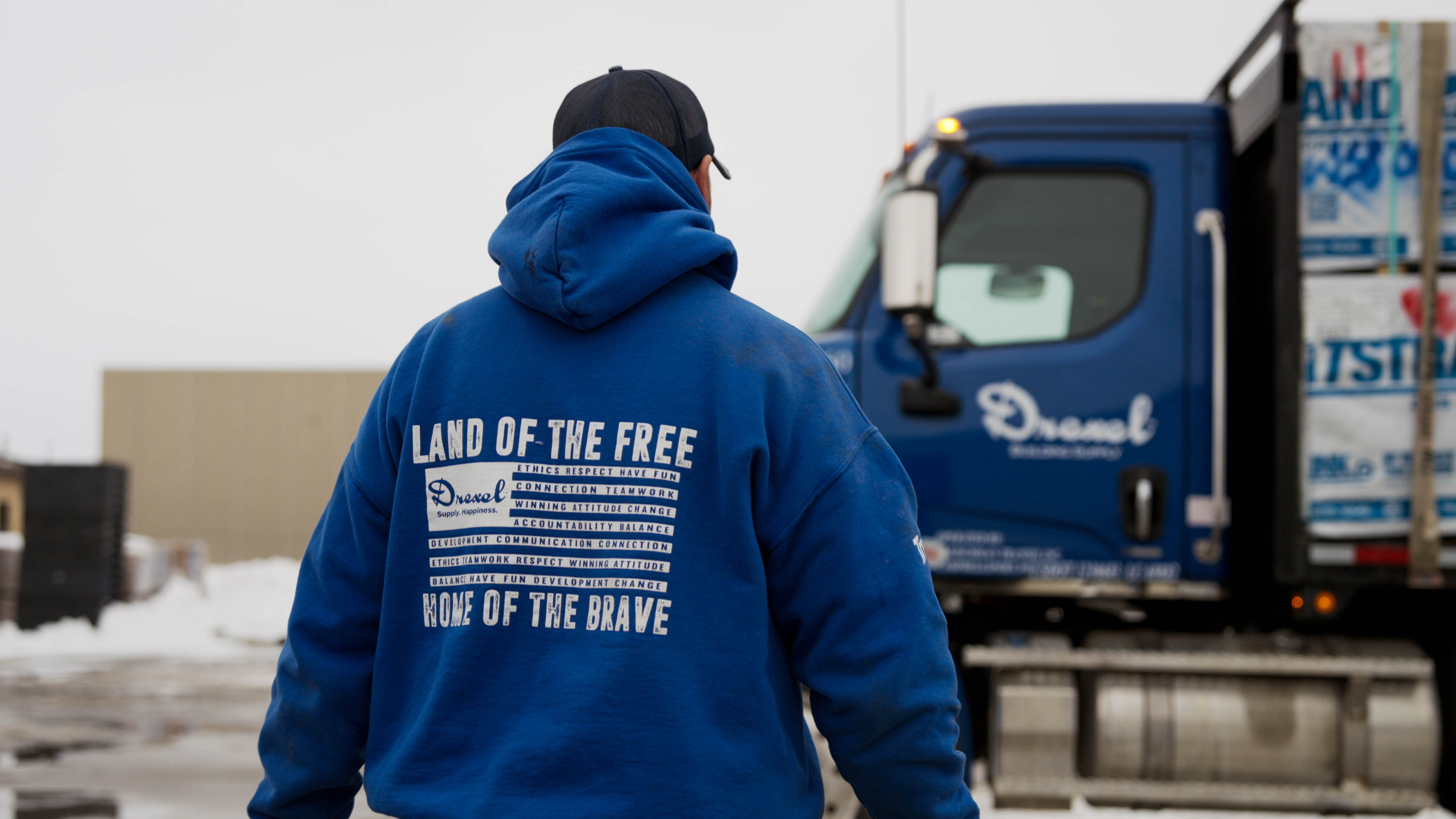
media
We like to let the Holy Spirit guide us, but we’ve created a set of guardrails to best bring our brand to life.
logos
Print-ready logo files
Use print-ready logo files for projects such as physical banners, print flyers, signage, etc. The Reflex Blue logo is our preferred logo. However, black and white versions are included for use if the Reflex Blue logo isn’t legible on the design background.


Web and digital logo files
Use web and digital logo files for projects such as website banners, social graphics, email graphics, etc. The Reflex Blue logo is our preferred logo. However, black and white versions are included for use if the Reflex Blue logo isn’t legible on the design background.
clear space
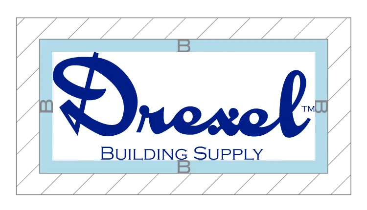
The minimum required clear space is defined by the measurement equal to the height of the uppercase “B” of “Building Supply”
Grey striped area indicates the Safe Zone. Other graphical and visual elements can be safely positioned up to the adjoining Blue area. Blue indicates Clear Space. The blue area must be kept free of all other graphical and visual elements.
what to avoid
Using our logo consistently provides brand recognition.

Do not distort, stretch or skew.
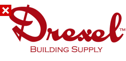
Do not alter the color.

Do not rotate.

Do not change the layout.
colors
Using our logo consistently provides brand recognition.

Pantone: Reflex Blue
CMYK: 100, 95, 13, 9.5
RGB: 0, 29, 135
Hex: #001D87

White
CMYK: 0, 0, 0, 0
RGB: 255, 255, 255
Hex: #FFFFFF
fonts
Using our logo consistently provides brand recognition.
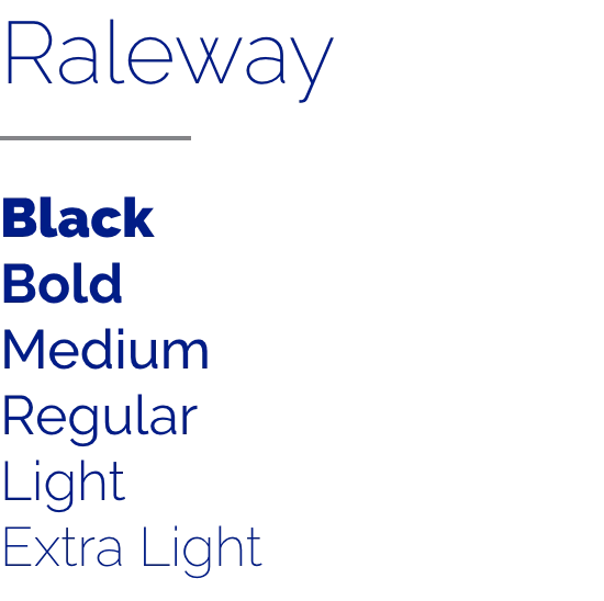
Raleway can be downloaded here

Copperplate Gothic can be purchased here.